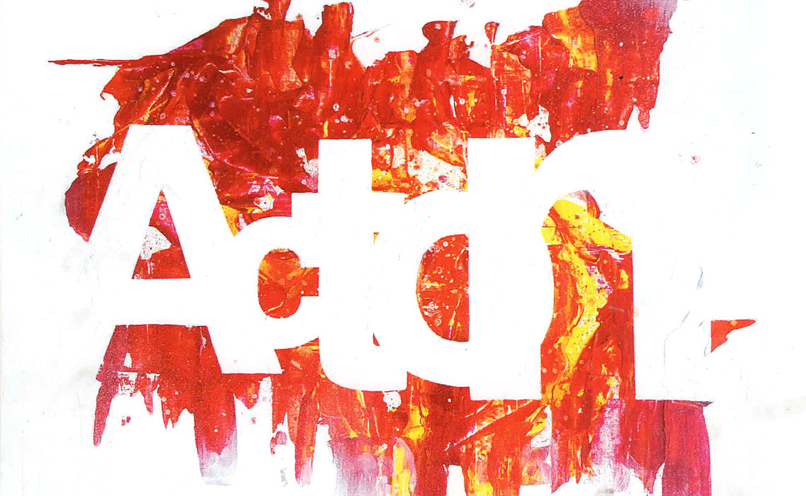
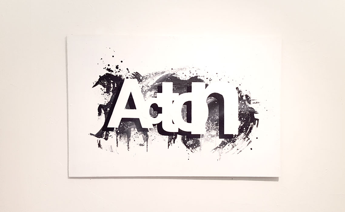
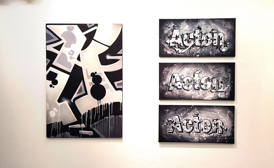
Literally.
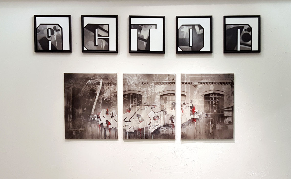
“One of the most common typefaces in western world is Helvetica. It’s seen both in corporate logos as well as the various signs and billboards around urban environment to the point it becomes boring. Or maybe, because it is so extremely neutral, you don’t get bored to it, you just stop paying attention to it. The typeface is a perfect messenger: people focus only on the message, not the appearance of the font.”
So, is it possible to combine Helvetica with graffiti?
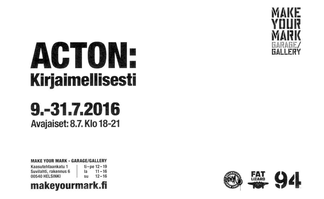
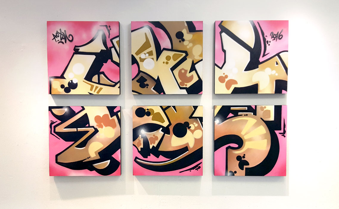
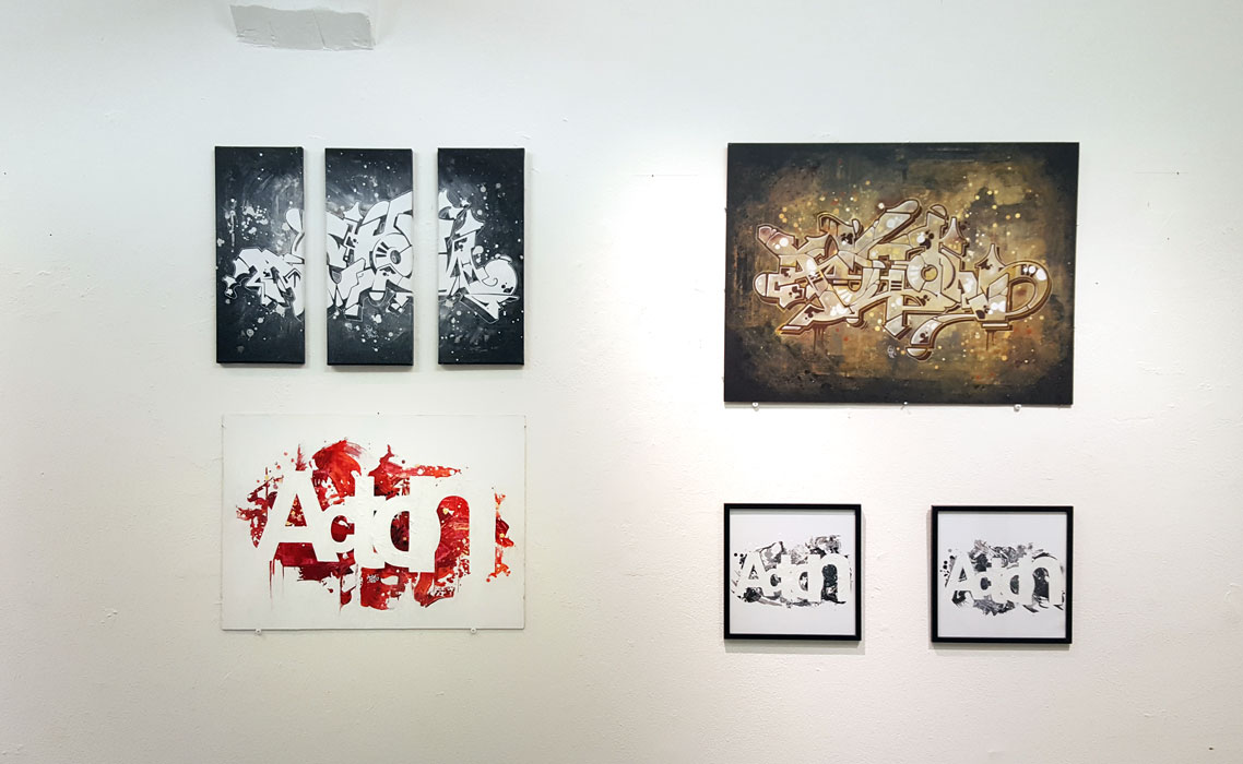
The exhibition was my first solo exhibition in an art gallery and it took place at Make Your Mark gallery, Helsinki.